CSS Animation Properties 101: Mastering the Basics
Exploring the Essentials of CSS Animation Properties


"Modern CSS properties now hand you nearly all of the tools you’ll need to create memorable experiences for your users."
Adam Kuhn, front-end web developer
Introduction
CSS Animations is a powerful module of Cascading Style Sheets that adds dynamic and engaging animations to websites and apps. With CSS animation, you can gradually transform an element from one style to another, creating a versatile and delightful user experience.
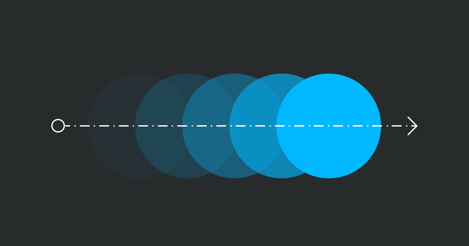
A CSS animation is defined by creating a set of keyframes.
Keyframes are used to specify the values for the animating properties at various stages of the animation. The browser then smoothly transitions these properties between these keyframes, producing a seamless animation effect.
Keyframes are specified using a specialized CSS at-rule — @keyframes.
Syntax
keyframes animation-name {
 keyframes-selector {
               CSS-styles;
                    }
}
animation-name - This specifies the name of the animation created in keyframes describing the animation’s styles.
keyframes-selector: This specifies the percentage along with the animation when the keyframe occurs. Percentages area is a representation of the animation duration, where 0% represents the starting point of the animation, 50% represents the midpoint and 100% represents the endpoint, etc.
CSS-styles: This defines one or more than one CSS style property.
CSS Animation Properties
Let's take a look at some of the sub-properties of the animation property:
animation-duration
animation-duration specifies the amount of time(in seconds or milliseconds) that an animation takes to complete one animation cycle.
Example: We specify the animation-duration to be 4 seconds.
animation-delay
animation-delay specifies the delay between the beginning of an animation sequence and whether it should start immediately from its beginning or partway through the animation.
Example: We specify the animation-delay to be 3 seconds.
animation-iteration-count
animation-iteration-count specifies the number of times an animation should be played. animation-iteration-count can have the value of 'infinite' where the animation would play forever.
Example: We specify the animation-iteration-count to 3.
animation-direction
animation-direction specifies whether an animation should be played normally or in alternate directions.
It can have four values-
normal- The animation is played as normal, i.e. forwards.reverse- The animation plays from the end state to the start state.alternate- the animation moves forwards at first, then backwards.alternate-reverse- the animation moves backwards at first, then forwards.
Example: We specify the animation-direction as alternate.
animation-timing-function
animation-timing-function specifies how an animation progresses through the duration of each cycle, using a speed curve that defines the time an animation uses to change from one set of CSS styles to another.
It can have seven values -
ease- The animation starts slowly, then becomes faster, and ends slowly.ease-in- The animation starts slowly, but accelerates at the end and stops abruptly.ease-out- The animation starts quickly, but slows down at the end.ease-in-out- The animation starts slowly and ends slowly.linear- The animation maintains the same speed throughout the animation.cubic-bezier(n,n,n,n)- A Cubic Bezier curve is defined by four points P0, P1, P2, and P3. P0 and P3 are the start and the end of the curve and, in CSS these points are fixed as the coordinates are ratios. P0 is (0, 0) and represents the initial time and the initial state, P3 is (1, 1) and represents the final time and the final state.steps(n, jump-term)- Specifies a stepping function, where CSS transitions in a series of steps, with two parameters. The first parameter specifies the number of intervals in the function. The second parameter, which is optional, specifies the point at which the change of values occurs within the interval. The animation will jump from state to state instantaneously.There are four possible jump-terms:
Jump-start(orstart): the first jump happens when the animation begins.Jump-end(orend): the last jump happens when the animation ends.Jump-none: there is no jump at the beginning or end.Jump-both: there is a pause at both the beginning and end.
animation-fill-mode
animation-fill-mode specifies how an animation applies styles to its target before and after the animation plays.
animation-fill-mode can have four values -
none- No animation styles will be applied to the element before or after it is executed.forwards- The animation will retain all styles applied in the final keyframe (depending on theanimation-direction) of the animationbackwards- The element will get the style values that are set by the first keyframe (depending onanimation direction) and is retained during the animation-delay period.both- The animation will follow the rules for both forwards and backwards, extending the animation properties in both directions.
Example: We specify the animation-fill-mode to both.
animation-play-state
animation-play-state specifies whether to pause or resume an animation sequence or to start an animation in a paused state.
animation-play-state can have two values -
paused- This value specifies the animation is paused.running- This value specifies the default animation, which is running.
Example: We specify the animation-play-state to paused while hovering.
animation shorthand property
animation, the CSS animation shorthand property, specifies the way to write CSS animation properties in a more concise way by grouping multiple animation-related properties into a single shorthand property.
Example: We specify the animation shorthand property to have 6 animation properties: animation-name, animation-duration, animation-timing-function, animation-delay, animation-iteration-count and animation-direction.
Conclusion
In this article, we delved into commonly used CSS animation properties and their values, exploring how they can be used to animate elements on a webpage. With CSS animations, it's possible to achieve simple animations without relying on JavaScript.
CSS Animations make a website visually attractive and go a long way in enhancing the user experience, thus creating a more enjoyable browsing experience.
📖References
Thank you for taking the time to read this blog. I hope you found it informative and enjoyable!
Catch you guys on the next one. Cheers .. ✌️