
Accordion Menu using React
Designing a Simple and Responsive Accordion Menu with React and Tailwind CSS


Accordion is a commonly used project in web development that enables developers to create accordion menus, which are collapsible sections of content that can be expanded and collapsed by clicking on a header.
In this blog, we will build a simple and responsive Accordion Menu about the James Webb Telescope with the help of React and Tailwind.
Our Accordion Menu will have three components:
🪗Data Component
We will create a questions array in the data component which will contain an array of objects, where each object will represent a single question and its answer along with the following properties:
id: A unique identifier.title: the question.info: the answer.
const questions = [
  {
    id: 1,
    title: 'When was James Webb Space Telescope launched?',
    info:
      'The James Webb Space Telescope was launched on December 25, 2021, from Kourou, French Guiana. It arrived at the Sun-Earth L2 Lagrange Point in January 2022.',
  },
  {
    id: 2,
    title: 'Which rocket launched James Webb Space Telescope?',
    info:
    'NASA’s James Webb Space Telescope was launched on an Ariane 5 rocket. It is a European heavy-lift space launch vehicle which is developed and operated by Arianespace for the European space Agency (ESA).',
  },
  {
    id: 3,
    title: 'How much did the James Webb Space Telescope cost?',
    info:
      'The James Webb Space Telescopes  major redesign in 2005 led to the current approach, with the construction completed in 2016 at a total cost of USD 10 billion.',
  },
  {
    id: 4,
    title: 'James Webb Space Telescope is named after which person?',
    info:
      'James Webb Space Telescope is named after James E. Webb. He was the administrator of NASA from 1961 to 1968 during the Mercury, Gemini and Apollo Programs.',
  },
  {
    id: 5,
    title: ' When were the first images from James Webb Space Telescope released?',
    info:
      'The first images from the James Webb Space Telescope was released to the public via a press conference on July 11, 2022.',
  },
]
export default questions
We will then export this array and use it in the Accordion Component.
🪗Question Component
Now, let's create another component that will render the title and answer of the question and a button to toggle the visibility of the answer information.
We'll define a component called Question, which will take in title and info props. Let's also import the useState hook to create a showInfo state variable and a setShowInfo function to toggle the visibility of the info text.
We'll also be using react-icons which you can install using:
npm:
npm install react-icons --save
or yarn:
yarn add react-icons
After installing them, import the following icons from the react-icons library.
The component will return an article element, within which there will a header element with an h4 tag displaying the title prop, and a button element that will toggle the showInfo state when clicked.
import React, { useState } from 'react';
import { AiOutlineMinus, AiOutlinePlus } from 'react-icons/ai';
const Question = ({ title, info }) => {
  const [showInfo, setShowInfo] = useState(false);
  return (
    <article>
      <header>
        <h4>{title}</h4>
        <button className='btn' onClick={() => setShowInfo(!showInfo)}>
          {showInfo ? <AiOutlineMinus /> : <AiOutlinePlus />}
        </button>
      </header>
      {showInfo && <p>{info}</p>}
    </article>
  );
};

export default Question;
Depending on the state of showInfo, the button displays either a minus(-) or plus(+) icon from the react-icons/ai library.
Finally, if showInfo is true, the info prop is displayed inside a p tag.
🪗Accordion Component
Let's import the data component and the SingleQuestion component from Question component. We'll again use the useState hook to initialize the questions state with the data array.
Inside the return statement, we will render the main content of the application. We'll have a div with a h3 heading and a section containing the questions and answers. We'll render the questions by mapping through the questions state using questions.map().
import React, { useState } from 'react';
import data from './data';
import SingleQuestion from './Question';
function Accordion() {
  const [questions, setQuestions] = useState(data);
  return (
    <main>
      <div>
        <h3>James Webb Space Telescope FAQs</h3>
        <section>
          {questions.map((question) => {
            return (
              <SingleQuestion key={question.id} {...question}></SingleQuestion>
            );
          })}
        </section>
      </div>
    </main>
  );
}

export default Accordion;
For each question, a SingleQuestion component is rendered, where we passed in the key and the spread props of the question object. The key prop is used to keep track of each question in the list, and the spread props are used to pass in the id, title, and info values of the question object as props to the SingleQuestion component.
Adding Tailwind
Let's add Tailwind CSS to both our Question and Accordion Component. We will ensure that the Accordion Menu is responsive to different media sizes. You can also change the values or add new ones to suit your preferences.
Question Component with Tailwind
import React, { useState } from 'react';
import { AiOutlineMinus, AiOutlinePlus } from 'react-icons/ai';

const Question = ({ title, info }) => {
  const [showInfo, setShowInfo] = useState(false);
  return (
    <article class='py-4 px-6 mb-5 rounded-md shadow-md hover:shadow-slate-500 bg-yellow-500 text-black'>
      <header class='flex justify-between items-center'>
        <h4 class='text-base md:text-lg font-mono font-bold leading-6 tracking-wider mr-4'>
          {title}
        </h4>
        <button class='sm:w-6 sm:h-6 md:w-8 md:h-8 p-1 md:p-2 rounded-full bg-slate-800 text-yellow-500 cursor-pointer flex justify-center items-center' onClick={() => setShowInfo(!showInfo)}>
          {showInfo ? <AiOutlineMinus /> : <AiOutlinePlus />}
        </button>
      </header>
      {showInfo && <p class='my-3 mr-10 font-semibold'>{info}</p>}
    </article>
  );
};

export default Question;
Accordion Component with Tailwind
You can add a custom background image in the tailwind.config.js file using the extend property:
  theme: {
    extend: {
       backgroundImage: {
        'space': "url('https://economictimes.indiatimes.com/thumb/msid-96270449,width-3000,height-1732,resizemode-4,imgsize-949414/james-webb-space-telescope.jpg?from=mdr')",
      },
    },
  },
  plugins: [],
}
We'll give it a custom name: space and use it as follows:
import React, { useState } from 'react';
import data from './data.js';
import SingleQuestion from './Question1.jsx';

function Accordion() {
 const [questions, setQuestions] = useState(data);
  return (
    <main class='min-h-screen bg-space bg-cover flex justify-center items-center'>
      <div class='w-10/12 max-w-4xl mx-auto rounded-md py-12 px-8 lg:flex lg:items-center border border-yellow-500  bg-gradient-to-r from-slate-900 to-black'>
        <h3 class='text-center text-xl md:text-3xl font-semibold tracking-wide italic text-white font-mono mb-10  lg:mb-0'>James Webb Space Telescope FAQs</h3>
        <section>
          {questions.map((question) => {
            return (
              <SingleQuestion key={question.id} {...question}></SingleQuestion>
            );
          })}
        </section>
      </div>
    </main>
  );
}

export default Accordion;
Import the Accordion component into your App.jsx component, run the server, and check out the output:
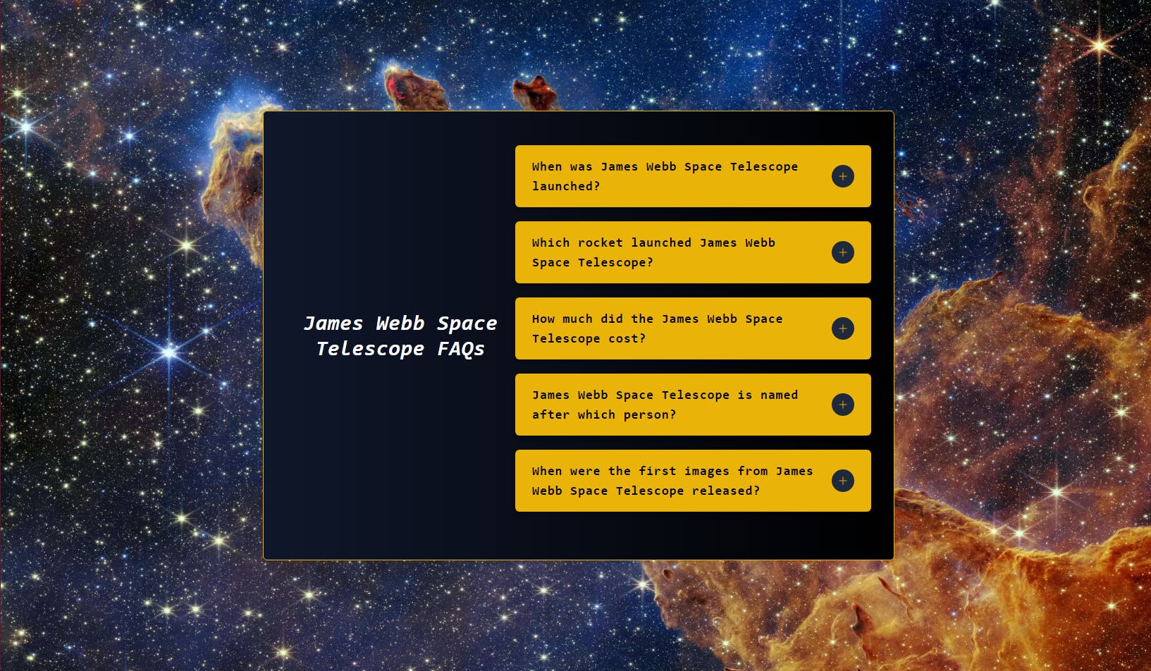
PS: Open the image in a new tab.
Conclusion
We've just created a responsive Accordion Menu about the James Webb Space Telescope.
Together, these three components form a FAQ page that can display the questions and answers dynamically and also allows each question to be expanded or collapsed individually.
Thank's for taking the time to read this blog.
Catch you guys on the next one. Cheers .. ✌️